

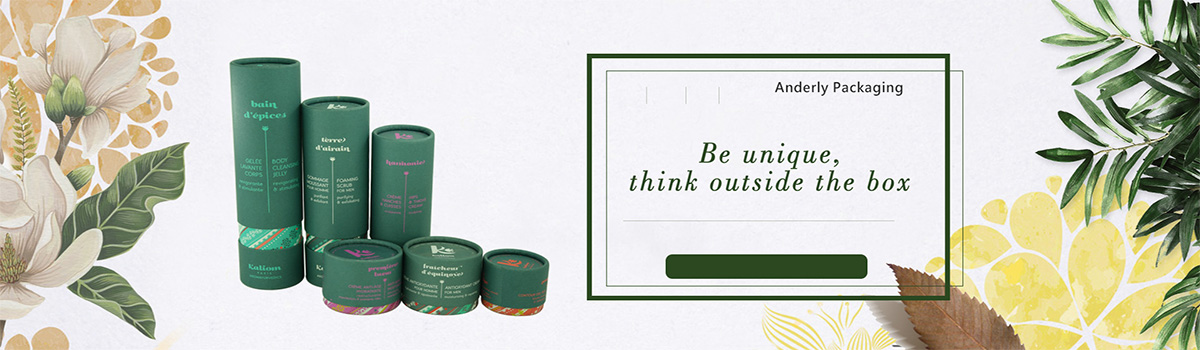
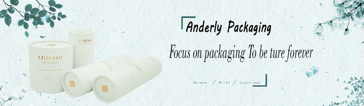

Anderly Packaging
News
- CUSTOM PAPER TUBE PACKAGINGThe smart and beautiful paper tube boxes are fully customized. The choices for customization are endless. Choose between natural kraft paper, matte white, shiny laminated coating or whatever other color you want. Want to customize your own vape packaging or white label a CBD product? We are able to put your logo and custom design on all of our products! Design your own custom branded packaging that stand out from the crowd. Whether you need exceptional logo design or custom packaging, we are here to help you boost your brand. This child resistant paper tube features a locking button. The button locks into the hole on the lid. To open the lid, the button must be pressed. This increases the difficulty for children to open the lid. The paperboard tube itself is a special presence in the cannabis packaging world, where marijuana packaging often comes in the forms of cardboard boxes, glass jars, and plastic vials. Cardboard tubes can easily draw customer`s attention on the retail shelf thanks to its elegant cylinder shape. In addition, we support customization with full-color printing, embossing, debossing, spot UV, and foil stamping. This adds an aesthetic sense to convey your brand values and attributes, helping your brands stand out in a dispensary shelf. Our SafeCylinder child-resistant packaging paper tubes are made with the safety of our little ones in mind. This is a 2-piece paper tube with simple but effective child resistance locking mechanism. We add a hard PVC round button on the tube top. A specially cut EVA foam is used to fix the button. On the tube body, we cut a hole to accommodate the locking button. To release the tube top from the tube body, we need to press the locking button, rotate the tube top a little bit and then pull the tube top out. This paper packaging tube is 100% customizable. Just name your products to be packed, and we can custom make one tube for you. Our paper tube can be completely custom printed. We support CMYK and Pantone color printing. We also provide special finishes to vividly present your creative artwork. Our surface finishes include spot UV coating, foil stamping, embossing & debossing.
2019 06/11
- Cylinder Paper Tube Packaging Widely UsedCylinder paper tube packaging is more and more widely used, it seems that in favor of the construction of environmentally friendly society, played a leading role! In recent years, the paper mill industry, paper making, circular tube packaging industry has made great progress. But at the same time in the development do not forget the importance of environmental protection, so how to develop conducive to environmental protection, society, the construction of a harmonious society? The first is to solve the raw material source to do a good job in the protection of the original forest and the new fast growth forest coordination, the second is to deal with the paper mill use of straw as raw material so as to increase the income of farmers and rice, wheat and straw pulp production enterprises environmental protection standards coordination. In essence, the paper industry needs to deal with the relationship between economic development and environmental protection. And how to deal with the relationship between the two, paper industry needs to consider, other industries such as coal industry, hydro-power industry, chemical industry and other industries also need to seriously consider. On the whole, the development of circular tube packaging technology can be summarized into the following aspects: first, single-layer fabric is transformed into multi-layer fabric; Second, flexo printing, screen printing, offset printing, gravure printing and other printing methods coexist, among which the most common is flexo printing; The third is to adopt more rigorous testing technology to meet the constantly improving cleaning and environmental standards. With the development of technology, more and more high-tech methods are used in carton and packaging and other work temporary, so that many cartons and packaging in production and production technology power has a substantial advance, and the entire production process is more reasonable and scientific. Like the former plastic packaging kneading, hot pressure, stamping and other production methods have gradually been widely used to cardboard packaging production, so that the former can not use paper packaging goods also began to use paper packaging.
2019 06/03
- Packaging Plays An Important Role in Your Cosmetic BusinessIn order to increase the sales of the products, cosmetics brand has a very effective strategy -- a good packaging to show their products. Packaging is the product of the true face, and will drive the purchasing behavior. Its reference to store products also plays an important role. A cardboard packaging provides numerous technical and aesthetic possibilities, under all the levers of control, the cosmetics brand marketing their products to consumers. However, considering the diversity of choice, choose the right package will soon become a real problem. How to design a packaging that fits your product? Do you have standard packing? What are the best practices to consider for successful packaging? The cosmetics market is very diverse. In terms of packaging, the selection of boxes is consistent with the positioning of products. The more expensive the product, the better the packaging must be in order to maintain the same level of content. Mass-market cosmetics require a simple box: for mass-market products priced under $20, a basic, inexpensive box is usually used: a folded box with opposite glossy or matte film-coated legs. The case fulfills its basic functions: protecting the product, ensuring its good display on shelves, and providing consumers with all necessary legal information: product ingredients, expiration dates and various regulatory hieroglyphs: capacity, etc. The packaging also conveys the brand's marketing message on the printable surface of the product. Choose a better box for mid-range cosmetics For mid-range products priced between $20 and $50, we always use foldable leather cases, but this is a more qualitative one. The cardboard is thicker and of superior quality. In this series of products, the whiteness of the inside and outside of the carton must be impeccable. The cartons used are usually pure cellulose. Gold-plated gold or silver will be affixed to the printing to give more added value. High-end cosmetics are beautifully packaged and beautifully packaged For top-of-the-line products that cost more than $100, you must use an excellent box with creative designs and customized marketing messages to convey a high-end image. The materials used should be on the top: high density, super fine details, multiple structures with the size of the product, to give complete protection. Don't hesitate to use the best printing materials and techniques, such as embossing and bronzing, but remember: less is more. For high-end products, good packaging is not necessarily the accumulation of luxury features. However, design is a deciding factor to show how special the product can be. Environmentally friendly and recyclable cartons for organic and natural cosmetics Organic and natural cosmetics are facing increasing consumer demand. They respect precise specifications. Packaging must also follow this trend. The use of environmentally friendly recyclable cardboard makes the packaging of the products conform to the ethical and ecological values of the cosmetics brands that respect people, nature and animals. From a purely commercial point of view, the choice of environment-friendly packaging materials can also win consumers' positive comments on products and promote sales when the product quality is worthy of consumers' favor. In any case, the packaging of various cosmetics is now an important factor to be carefully considered. Choosing the right and good packaging is now becoming increasingly critical to the success of your cosmetic business.
2019 05/27
- The Advantage of Custom PackagingWhy choose a custom packaging? Getting new customers is a big problem for many companies. In a 2010 survey, recruiting new customers cost five times as much to market as retaining existing ones. Not only are they more likely to buy your product, but they can be true ambassadors for your brand. As you know, the mouth speaks the mind... As a result, these clients provide a lot of free advertising to their friends, family and colleagues. In addition, statistics show that personalized packaging encourages repeat purchases. A 5% increase in customer loyalty leads to a 25% increase in sales, says management consulting firm Bain & Company. This custom packaging design and use will cost you money, but according to them, the investment is worth it and will pay off. How does custom packaging promote buying behavior? How do you make sure that consumers start to understand your brand? At any time, anywhere, anytime, bring it up. Standout packaging is a practical and inexpensive tool, much cheaper than media hype on television or radio. Receiving good products is often not enough. Customers want to be attracted to a creative concept that is fresh and especially memorable. Customers won't remember you if your package is like any other. Our advice: give the customer something he has never seen before. Unlike your competitors, this is the only way to make a lasting impression and become "top conscious." Research shows that 72% of consumers will naturally will attract people's packaging with high quality brand. Personalized packaging shows that as a company, you are proud of your brand and you give your troubles high-quality packaging. Give you the crate or package a private contact, you will notice that your brand will increase of trust. Below, we have some ideas: Play with colors Looking for all types of custom packaging overview? Check out our website. Boxes, ribbons or bags... Almost anything is possible. Just add a little color to your package and your product will instantly look more attractive. Use the packaging as a mirror for your brand Customers will buy products they feel close to more quickly. So it's good to know who your company or product is targeting, and then tailor your packaging to the buyer's age, gender or personality. Gender-specific packaging is an obvious example. Specific palette colors and specific images or shapes can be applied to one type rather than another. Nearly 37 percent of women are more likely to identify with gender-packaged products, according to the study. Make your packaging collectable Many big brands have taken this step, offering personalized packaging to their customers. This can be targeted or untargeted. You must remember Coca-Cola's successful campaign a few years ago, when everyone was looking for a bottle of coke with his name on it. This movement is a clear example of aimless action. Sales of bottled wine even rose 2 per cent in the years after its launch. Natla's situation may also be familiar. Customers can put their name on a jar or design a new version for themselves online. This is an example of targeted action. Each jar of Nutella is unique. These examples show different ways to add personal touch to your packaging. Your packaging becomes a true collector of items! Now, in a hurry to start your custom packaging project? Do not hesitate to contact us and let our entire team become your support for a successful marketing with custom packaging!
2019 05/20
- Where Can You Buy Empty Lipstick Tubes?Where can I buy an empty lipstick tube? We suggest to buy directly from packing manufacturer. Professional paper tube packaging manufacturers can not only provide cosmetic tube packaging, food tube packaging and essential oil packaging, but also provide red tube packaging. Buying products directly from the paper tube packaging manufacturer has the following advantages: -Quick response. Manufacturers are quicker to communicate in a timely manner than traders who are completely bankrupt. -Quickly obtain custom samples of paper tube packaging from manufacturer. We need to confirm the details of the packing before we can officially produce the packing. The packing factory can provide samples within 3 working days at the earliest. -Lower wholesale prices. Direct contact with manufacturers, reduce intermediate links, reduce packaging costs.
2019 05/13
- The Material Prices of Cardboard, affect our tube packing?China's online manufacturers and retailers face higher costs, and the shortage of packaging relies on further increases in the price of the raw material cardboard, which was announced a year ago, but what impact has it had on paper tube for overseas buyers? Let's review its origin. Since August 2017, China's largest wrapping paper manufacturer has raised the price of raw paper four times. The increase was a whopping 70 percent. To remedy the situation, some retailers reduce costs by recycling boxes, while most respond by raising prices. There is more than one reason for the changes, according to one insider. In particular, the major state-owned paper companies are heavily indebted due to fierce competition, so this is a way for them to reduce their debt ratio and improve their profits. It is important to know that China is bringing unimpeded development to the world pulp market today. In the past 20 years, China has become the world's first pulp consumer market. Rising living standards, as well as the buoyancy of paper and cardboard packaging, explain the growth in demand that would otherwise be stable in the rest of the world. Tensions in 2017 increased in the first three quarters of 2018, particularly as supply dwindled due to prolonged technical shutdowns at some nuclear plants and delayed installation of new plants under new environmental protection policies. As a result, the price of fibrils used to make cardboard has risen to historic levels throughout 2018. That could be over by August 2018, as the government has eased restrictions that have closed thousands of factories amid fears of an economic downturn. Yet raw materials remain relatively expensive. However, our custom tube packaging box customers can have quite a few concerns about this situation. Here's why: The impact of higher prices on high-end bespoke boxes has been minimal It is important to know that we focus on high-end and custom tube packaging box solutions, unlike bulky packaging cartons, these tube packaging boxes are made of many different materials and complex processing techniques. Compared with all those raw paperboard, paper only needs a small part of the cost, there is no need to increase the price. The MOQ is very small and the material only accounts for a small part of our cost We like to offer personalized and flexible quotes, which means we can even accept a MOQ of 500 for some models. This will not lead to the mass use of materials, cardboard price difference is not even noteworthy. Better production management can compensate for the cost Through better production management, increase production system, using new technology, we can even come up with a better price than before the rising prices of raw materials, it can be from different aspects: reduce material waste, improve workers' productivity, better system arrangement, reduce unnecessary costs, improve our design services, bring more added value for your package, we believe that our competitiveness is through our efforts, continuously upgrade our production and service system. In a word, you do not need to worry about the increase of the cost of cardboard raw materials, more meaningful is that we will focus on bringing excellent products and excellent tube packaging boxes for customers
2019 05/06
- The Packaging as A Marketing ToolPackaging is an important marketing tool in e-commerce, which is directly related to the product itself, rather than just the main function of the product. How to think or modify your product packaging to enhance your marketing? Here, we give you all the tips you need to improve your image. Why did you redesign your packaging Packaging is more than just a functional, information-rich container. It is an important part of the customer experience product. It is a powerful marketing tool, conveying the brand image and carrying its visual identity. Like any marketing tool, packaging can be bad for the brand. This is especially true if the product or the packaging itself is damaged in transit. In fact, 25 percent of consumers will avoid buying products with damaged packaging in e-commerce, and 73 percent will not buy products with the same damaged packaging when they are shipped. In addition, these dissatisfied customers will not not share their opinions, and at least 84% of Internet users will consider their opinions. Therefore, every package from the box or bottle containing the product to the shipping package is important and must be carefully considered. What are the basic characteristics of a good package In order to realize its main functions while satisfying customers' needs, packaging must meet certain requirements: packaging must be consistent with the image and value of brand and product. Packaging is the first aspect that customers see and touch before they discover a product. The package containing the product must contain all technical and functional qualities of the product. Finally, each package must be protective and solid. This quality is even more important for shipping packaging, which will be handled repeatedly by the carrier. How to identify or redeem your packaging In order to enhance your marketing and enhance your brand image through packaging, you may need to reinvent it. Here are some good practices that have been proven. Don't be afraid to embrace an original concept: put something original that will add value to your e-commerce. Note: original doesn't mean complicated. The packaging can be original and simple. The customisation is also popular: it can be a simple "thank you" personalised package, or seasonal, with coloured vellum, patterns or glittering christmas-themed packaging. You have so many possibilities that make you stand out. Let your imagination play a role, or just turn to professional packaging suppliers such as us to bring tons of ideas. Finally, environmentally friendly packaging is becoming more and more popular because it demonstrates the brand's commitment to current major issues and testifies to real value. Packaging, which is often underrated, proves to be a powerful tool for enhancing your marketing value for the first time to your customers with your brand. If it is original and personal, it could even become popular on social networks, boosting its reputation at a lower cost. Bet on a good package and you have everything to gain!
2019 04/23
- Let's Look at Package Big Things from A Small PointWhen we choose a product, most of the first thing we see is the packaging. For ordinary consumers, they will pay attention to whether the packaging is beautiful, and then pay further attention to some information on the packaging. However, for the printing practitioners, we will consider the packaging materials and production process, and even intentionally or unintentionally look for some printing defects inside, such as whether the overprinter is accurate, and how the small words and lines deal with the edges of strokes... Because packaging is generally a mass printing, printing process will inevitably appear unsatisfactory place, so how to improve printing quality as far as possible? It is the so-called details of the real chapter, whether digital printing or traditional printing, the treatment of small elements are crucial. Here are a few lessons about how text and lines can be better reproduced in print. 1) Use vectorized text and lines whenever possible For books, newspapers, periodicals and picture albums, the final document is naturally a vector document because the designer used founder books or InDesign and other typesetting software at the beginning of the design. For packing, however, many designers will be based on personal habits use Adobe Illustrator, CorelDRAW, Photoshop (hereinafter referred to as the "AI, CDr, PS) software, if you choose to use PS into Tiff format for the final documents, due to its belong to the bitmap file, do not have vector properties, the printing quality is not very ideal, so vector and bitmap file is how to affect the printing quality? If the package is designed with PS and has a large number of small words and lines, the final output can be EPS file, and the vector properties can also be retained. But the disadvantage is the large amount of file data, in the subsequent operation will drag down the computer running speed. 2) The choice of colorific collocation The designer has an unwritten rule for the color allocation of small elements in packaging design, which is the maximum three colors theory. In other words, the fewer colors, the better. In multicolor overprinter, large area of elements are not obvious. For small text and lines, even the most advanced machines may overprint due to improper operation and machine error, which is called ghosting. Packaging is a lot of small text, all kinds of explanatory text, trademarks, bar code, etc., all need to consider the color configuration caused by the printing overprinter. A friend might ask, when configuring colors for an element, would it look good to use all three colors? This problem needs him stylist to solve, simple tonal and ok and tie-in gives beautiful picture likewise. The creativity of designers is endless, although the printing is a four-color mode, but three colors or two colors can be mixed out of the color is very rich. In order to avoid overprinter errors, many packaging at the beginning of the planning to consider the use of spot color, spot color is the best solution to avoid overprinter, not only can be printed out of the four colors can not achieve the color, but also to avoid the appearance of the dot, more important is to avoid overprinter. This is why spot colors are used extensively in toothpaste boxes, medicine boxes, flexible packaging, etc. 3) The treatment of black text and lines a) Black text in white background b) Black text in colored background
2019 02/26
- How to Save The Cost of Custom Paper Tube?To reduce the total cost of the custom packaging is the common goal of all products brand. The cost of a custom paper tube packaging has an important impact on the overall cost of the product, directly affecting the price of the product and the market competitiveness. In order to reduce paper control, you can use the following Suggestions: Select the existing tube molds. Because we are a manufacturer of custom paper tube packaging, we have thousands of brand produced all kinds of product packaging. There are many kinds of paper tube molds. The diameter of the cylinder mold is between 12mm and 228mm. Existing paper tubes can be made 12mm(inner diameter) with a maximum diameter of 228mm. You can choose the existing one according to your product. The mold will save $300- $500 in mold costs. For a small amount of custom packaging, the price of a single carton can be significantly reduced. Choose shipping. The price of sea transportation is usually one fifth or less of that of air transportation. We need to reserve enough time to arrange the delivery, which can save a lot of transportation costs. Choose a Chinese manufacturer. China custom packaging manufacturers lower prices, can meet the needs of low-cost packaging procurement. Moreover, China's current technology is advanced and can deliver high-quality product packaging on time. We are a packaging manufacturer in shenzhen, China, close to Hong Kong, and can meet all of your custom paper tube packaging requirements.
2019 02/21
- Common Product-Packaging Mistakes to AvoidThe packing of your products tells us a lot about your company. It should tell the world that your brand is strong, your products are first-class, and your business can be trusted. However, in many cases, companies make the following 10 common packaging mistakes. Here are some things to avoid. 1 Your packing is not environmentally friendly. It is difficult to provide 100% eco-friendly packaging for your products, but you should try to add some eco-friendly elements. Society rewards companies that manage their natural resources better. If you can modify the packaging design of your products to show your environmental protection, you may have new sales. 2 Your packing is cheap. Every company wants to keep costs reasonably low, but it shouldn't come at the expense of your packaging. A cheap package may break, which is a big problem, because the contents may overflow, damage or damage. Be frugal, but be wise. Your packaging should sell and protect your products. 3 Your packing is out of date. When was the last time you evaluated product packaging? Has it been many years, even generations? Outdated packaging may give long-term customers some nostalgia, but it's likely to be a waste of packaging material and give your company an outdated look. This is a common product packaging error - but it is easily remedied with the help of packaging design professionals. 4 Your product packaging design does not follow new rules or guidelines. When evaluating your product packaging, it is important to consider the rules, regulations, and guidelines governing your industry. If your product packaging design does not meet the regulation, you may be fined, or even worse. Be aware of any changes you must or should make. 5 People Are Making Fun of Your Product Packaging on Social Media. Social media matters. Millions of people post on Facebook, Twitter, Instagram and Pinterest. If there`s a growing movement mocking any of your packaging designs, you should take it seriously. Make the most of the situation by offering a contest between several prototypes and seeing which one consumers prefer. 6 Your packing is misleading. Have you ever bought a bag of crisps and found that most of them were filled with air? Really disappointed! This is a typical example of misleading packaging. The same applies to a bag of candy. When there are only four or five pieces in it, it seems to mean there is a lot of candy in it. Consumers don't like to be misled, so make sure your packaging properly represents what's inside. 7 Your packing is too big. Don't waste shelf space -- and don't waste your money. Too much packaging is defective product packaging. You can create custom product packaging that is not too cumbersome. Making your packaging smaller has another benefit: you may be able to save some money on each package. 8 Your packing is very difficult to open. Be sure to test your product packaging with your target audience. For example, if you're offering a product that you want your kids to eat at lunch, don't make it hard to open your hands. Even if they like the food inside, they will ask for something different. 9 Your packing looks too complicated. The best packaging is streamlined, making it easy for consumers to see what's inside. The product is highlighted without confusion. The worst packaging USES a messy design - it is too complex and leaves potential buyers confused about the product. Simple is always better than complex. Product packaging is an ever-changing part of your company`s business. When you feel the time is right to consider a new product package design, partner with a trusted leader in the industry. Contact us today to learn more!
2019 01/03
- Packaging Trend in 2019Whether you would like to admit it or not, the packaging design is very important. As the average consumer has access to a wide range of different products, companies constantly battle with each other to get your yuan. From pricing gimmicks to product positioning, companies are "buy me! Sample packaging design of. Creative packaging design can make better things become better! Packaging design is very important in advertising any product. Product packaging can motivate people to buy products. Do you want your packaging to be the best on the shelf? Here are ten trends in packaging design for 2019. Simplicity Simplify product information and enhance brand visual communication. Funny Package shape or picture interesting and vivid. Illustration With illustration as the design subject, tell stories for products. Color Using color is not a novel idea; color is often used to make sense and influence consumer choice. The use of proprietary colors can shape a product's unique identification symbol. Creative Font The application of font design as an important visual element of packaging design. Display Reasonable hollow packaging structure and material will be used to better display the original appearance of the product. Environmental Friendly Material The use of environmental friendly, biodegradable materials is the trend of the future, to protect our green earth. Cares For Experience Packaging not only needs to be beautiful, but also needs to pay attention to reasonable structure and consumer experience.
2018 12/24
- ANDERLY PACKAGING:A BRAND YOU CAN TRUSTAnderly Packaging is a leading paper tube box packagin and cardboard tube manufacturer. We work dedicatedly to reach the demands of our customers. We believe in working efficiently and bringing out the best quality products. Our company believes that the quality of the products we offer is directly proportional to the quantity we produce. Many companies sell similar products at lower prices, but sometimes the industry ignores the fact that this does not guarantee quality. Our production has gone through several different processes to ensure that the final product meets a great standard for our customers. Our employees receive appropriate training in these quality inspection procedures, which provide the highest quality and excellence for our products. We have been working in this industry since 1987 and have maintained our position as an industry leader by focusing on our customers. It even fits the values of our company"the customer matters most". As we all know, the production speed increases during the festival, and the main festivals to be celebrated, such as Christmas is coming. With the increase of customer demand, both food industry and construction industry.As productivity rises, so does demand for raw materials. Because customers have a higher demand for products relative to production capacity. But anyway, we believe in achieving every difficult goal and satisfying all customers, because we know that our customers depend on our products. The last thing you need is for suppliers to let you down, so Anderly Packaging ensures 100 percent supply. Our company works every day just to make sure that we don't disappoint our loyal customers and that there are no delays in delivering our products directly to them. Anderly can speed up product delivery safely and quickly at any time of the year. We have been able to deliver products in very difficult environments with unprecedented demands on our products. Our daily work centers on meeting the needs of customers. Anderly Packaging is a trusted brand when it comes to cardboard tubes and custom paper tube box.
2018 12/17
- How Does Custom Packaging Promote E-commerce Business?While the most important part of the customer experience is of course the product itself, as e-commerce continues to dominate B2C sales, the need for a "shareable" unboxing experience will only increase. The best part? Each product and each budget has custom packaging options that can increase revenue and bring real results to your business. Here's how. Sharing the unboxing experience on social media When a package is carefully packaged or decorated, consumers are more likely to show off to friends and social media fans. This "shareable" quality can increase brand recognition, boost sales, and encourage customers to recommend your products to friends and family.This personal touch is important: nearly 90 percent of consumers believe in online reviews as much as they believe in personal recommendations. Boost Brand Awareness for Repeat Sales In general, consider how packaging increases brand awareness and stimulates customer loyalty. For example, the success of Tiffany packaging proves that when a brand goes further, people will make a commitment to the brand. E-commerce retailers should be prepared to take advantage of the potential of custom packaging to build brand awareness. From custom-printed boxes and bags, to brand labels, to thoughtful design details like ribbons, customization sends a signal to your customers that your company CARES about their experience -- even if they're not. This thoughtfulness is crucial in the competitive online marketplace. Build trust in project professionalism When your entire business is online, your packaging is the primary way to make a positive first impression.Your packaging represents your brand, so try to be professional and inspire trust in consumers with a wide range of choices. When consumers see a brand invest in high-quality custom packaging, they are more likely to believe that the brand also invests in the quality of its products. In turn, consumers are more likely to buy brands they trust again and recommend their products to friends. Stand Out from Other Sellers You know your product is great, but most major e-commerce platforms are crowded with retailers offering similar products. Stand out from the crowd, provide the best customer experience, with unique customized packaging to stimulate more sales. When a customer is browsing a crowded online marketplace, it's worth including pictures of your packaging in your product list. Showcase your brand's unique style with high-quality photos of your packaging, your custom designs, or product images nestled in boxes and simulated unpacking with tissue.
2018 12/10
- 5 Mistakes to Avoid When Creating Custom Paper Tube PackagingWhat are the 5 biggest mistakes when customizing paper tube packaging? No testing the packaging No standing out on the market shelf No working with the right manufacturer Choosing the wrong materials Using the wrong specs Product packaging is essential . This is usually the first part of your business that your customers will see and help them decide how they should view your brand. If your custom packaging looks outdated, low quality, or unprofessional, your target market may think twice. To make sure your product gets out of the retail shelves faster, we have a list of the mistakes you need to avoid in your next design meeting. 1. Failure to Test Your Packaging If you bought a product, discover what's inside is broken or damaged, then you will know in advance the test package the durability and strength of how important it is for the company. Your custom packaging is not only to attract customers and look good, it is also to protect your products. Before you start shipping, make sure you thoroughly test your packaging to see if you can guarantee that the item you're selling is in the best condition. 2. A Design that Doesn`t Resonate Before you start designing anything or talking to a packaging manufacturer, be sure to research your target audience. The more you know about their expectations and ideals, the more you'll be able to create a package that catches their eye immediately. 3. Using Old and Outdated Packaging In you spent weeks or months to find suitable for you and your company's design, you will can't help but as long as possible to keep this kind of packing. Unfortunately, if your competitors keep upgrading their new and improved solutions, this may mean you look bored or outdated. Today's customers are attracted by the latest and most exciting things on the shelves. Sometimes this means that if you want to stay ahead of the competition, you have to update your packaging regularly. Try new concepts and be sure to keep up with current market trends through extensive industry research. 4. Choosing the Wrong Materials in Your Custom Packaging As mentioned earlier, the packaging you created is not only beautiful, but practical. Unfortunately, many brands mistakenly use the most popular, or the cheapest, materials instead of the ones that are right for their products and customers. For example, a home-sized food package may be overlooked by consumers if they know the box or package will be difficult to reseal. Ask yourself what your customers want from your packaging, and then evaluate your design to see if you live up to their expectations. 5. Using the Wrong Specs Finally, keep in mind that even if you work with the world's best packaging manufacturers, they can only do so much if you choose a product that doesn't have the right size and specifications. With this in mind, when you create your design, be sure to carefully examine what you need to save your product as safely as possible. Just as packing too big may waste money and disappoint your customers, packing too small is almost useless.
2018 12/03
- How Important is Packaging Design to Your Product`s Success?Product Packaging Solution Consider what kind of packaging design does to your product: The most important is packaging shows your brand. Packaging is communicated to consumers, presented images, displayed products, and provided instructions for use. Packaging makes your products different from competitors in design, color and shape. Packaging is your product advertisement. This is the last thing consumers see before they decide to buy your product. The general packaging is 10% of the retail price of the product. However, this margin will account for your sales either upward or downward. Cosmetics and electronics manufacturers may spend up to 40% or more on the packaging of the product cost, as a gift. A beautifully packaged product differs in point of sale. The additional care and cost required to produce an attractive package is not just through increased sales. Suggestions to Packaging Label Design: The packing should be functional. It should protect your product from any form of damage or deterioration. It should also be able to withstand transport and shipping. It should be environmentally friendly It should be easy to open and the product easy to use. It should be tamper proof. Packaging should have consumer appeal, a distinctiveness that makes your product stand out against a hundred other products on the shelf. Packaging, labeling and any additional information should be designed keeping in mind the profile of your target consumer. Understand your market and target them specifically. Packaging for a generic audience can confuse the consumer. Packaging should help build your brand image. It`s about communicating your product and building a relationship with your consumers through your brand image Packaging should stand out against your competitor`s products. Product Design: Health Supplements Information on how a product on that package of additional information can provide a consumer's motivation will help the consumer to make a education decision on your competitor's product. The packaging in the promotional flyer will help the consumer to know more about the product, and how it affects the health of consumers. It can build credibility and trust. These flyers can be used to introduce other products.
2018 11/26
- Green Paper PackagingGreen packaging solutions has become the norm, not the exception packaging companies around the world. Profound changes in enterprise standards, government policies, trade regulations and consumer tastes lead to paradigm to environmentally friendly packaging market solutions. There are about 5 billion plastic bags on the shelf and 12 billion is used for packing of fruits and vegetables. These bags in the ocean, they are life threatening Marine life. Non - biodegradability of plastic and its harmful environmental impact leads to debug regulations banning the use of plastic. This factor is paper packaging market development potential.Packing all the major policy concerns on the toughness, recycling ability, processing and light material. The quality of the product provider between the fierce competition in the food market. As a result of this parameter, manufacturers in the food market constantly manufacturing and delivering high quality products. An increase in the number of the supermarket and the supermarket is expected to be one of the key drivers of growth of paper and cardboard containers and packaging market in the next few years. Rapidly expanding retail sector organizations, lead to an augmented for food and beverage and other consumer healthcare products demand. Most retail stores are reserved to the use of packaging material not only food but also food nutritional value. More and more consumer is buying groceries, including frozen and refrigerated foods, predicts that, in turn, the growth of paper packaging market. The food manufacturing companies have become cautious and are making extra efforts in the packaging of products. Various ranges of packaging materials in the market are available to fulfill various packaging needs, like Paper Canister ,Food Grade Paper Tube and cardboard boxes. More and more factories throughout the region, coupled with the growing consumption and transport packaging industry in the asia-pacific region, resulting in development of paper packaging market. In the countries in the asia-pacific region, China has owned the largest share of the market and India estimates of the fastest growing market in the forecast period.
2018 11/21
- Why Should Anderly Packaging Be Your Trusted Cardboard Tubes Supplier?We understand your product and requirements. We believe in the quality of what we delivering.Quality comes only by listening closely to customer requirements and carry out. At anytime we get an inquiry, the first step is to do a detailed specification with our client. We listen to how they will use the cardboard tubes, we take some additional pieces of information such as how the tubes will be stored on the customer`s premises? What are the shelf life and consumable life of the product with which the paper tube will be used? Is the product going to be stored in one place or is it going to be shipped a lot? How much transportation is associated with the product? What kind of handling of the product is done? What is going to be the damage cost for the product? Are our paper tubes going to be reused or recycled? Working with several more such questions, we are able to provide a detailed quote that will be cost effective for the requirements. Our products have met with wide endorsement. and we`ve gained a lot of experience in our customers` ways of working. We are always willing to come and visit your site, Anderly Packaging has developed a great command on technical aspects of both materials and machines. We have always been keen on quality deliverables resulting in maximum customer satisfaction. So, we are always looking at the way to innovate and working alongside our customers, big and small to facilitate your new product development. We`ve spent a lot of time researching the most suitable raw materials for our tube production so that our products are always fit for purpose. In a lot of cases, we have also experimented by using our machines under different capacities to get the desired outcome as per the client need and description. Unlike our competitors, we also put a lot of time and effort into the packaging requirements, so our tubes arrive just how you need them. We don`t just deliver the product, we own it! Visiting a customer site helps us in gaining their trust. By learning how our materials are used and the ways they are they handled help us in shaping our products to the highest quality and purpose. Our on-site assistance is quick and available within hours. We`ll work with you to provide a JPT solution to the packaging problem you might be facing. We value our customers – no matter what the order size be! At Anderly Packaging, a customer is a customer, no matter what kind of order we are fulfilling. Whether you are a small business with just 2 or 3 people or an MNC with 1000+ employees, we value you equally. We will be as responsive and attentive to you as to our any other customer. We consider all our customers alike. We use all media to provide instant support to our customers. Email, call or social media, you can WhatsApp us anywhere and ask us anything, and in 24 hours your inquiry answered by someone from our team. We ensure that promises once made is kept! We don`t deliver just paper tubes, we deliver paper tube solutions! We understand the damage that can happen to your products by failing to package and understand the possibilities to improve the quality. Product damage hits your bottom line, but you can reduce this by using high-quality from Anderly Packaging. We don`t sell products, we manufacture great solutions that lead to wonderful solutions. Our focus is to manufacture every product as close as possible to the client`s need. We believe that the Anderly quality speaks for itself and needs no convincing. Our focus and dedication to foster only the best lead us to a position where we need not sell by pushing a client or imposing our products unnecessarily. Our cardboard tubes are well crafted to take us to a position where clients themselves feel convinced to work with us decade after decade.
2018 11/12
- The Influence of Green Packaging on EnterprisesIn modern material society, the reasonable use of packaging promotes the perfection of logistics system, and constructs a harmonious and economical circulation society. According to the circular economy concept, the development of modern logistics puts forward higher and updated requirements on packaging with reduction as the core -- providing green packaging and constructing green logistics system. Develop green packaging by applying the concept of circular economy 1. The development of packaging industry should conform to the principle of circular economy Circular economy is to use the ecology law to guide the economic activities of human society, to the efficient use of resources and recycling as the core, in order to "reduction, reuse, recycle" as the basic principle, with low consumption, low emission, high efficiency as the basic characteristics of social production and reproduction form, its essence is as little as possible resource consumption and environmental costs as small as possible to achieve the greatest economic and social development efficiency. The most important operational principle for implementing circular economy is the "3R" principle, namely Reduce, Reuse, Recycle. 2. Develop green packaging as the direction of the industry Green packaging is both a packaging concept and an ideal packaging. However, the green trade barrier in international trade puts forward more and more stringent requirements on packaging. Measures to develop green packaging and build a green logistics system 1. The research on green packaging should be innovated constantly, and new energy saving and environmental protection materials should be developed, so as to improve the testing level of the performance evaluation of packaging materials and establish corresponding standardized working procedures. 2. Strengthen technological innovation, focus on reduction, actively develop and promote various green packaging materials and equipment to meet the needs of logistics industry development and international trade.
2018 11/06
- What Are Exact Elements for Packaging Design?By the upgrading of consumption, the creativity and innovation of packaging design has become the primary condition to catch consumers' attention. Although the quality of packaging design is not equal to the quality of enterprises, consumers will have a preconceived concept: if an enterprise does not pay attention to packaging design, which will pay attention to product quality? There is nothing wrong with it. The first thing to evaluate a product is quality. So, what are exact elements for packaging design? The major components of the product are the design elements With the main component of the product as the design element, consumers can see at a glance what the raw material of the product is and what type of product it is. Common in food, daily chemical packaging design. Take the brand logo or auxiliary graphics as the elements This form is suitable for those famous brands, or those with beautiful logos and auxiliary graphics. This method is conducive to deepening consumers' impression of the brand, and such packaging has its own brand characteristics. Primary consumption object is design element For example, women's products often use women, flowers, butterflies, feathers, and children's products use animals, dolls, children as the main elements of packaging design, and pet products are used as the main elements of packaging design. Design elements directly from the product This kind of expression technique is commonly used in food packaging, which is suitable for brands with relatively high level of appearance of the product itself, such as common biscuits, snacks, fruits and other packaging. Mouth-watering food images are the most effective way to attract foodies, but they are more demanding for photographers and retouchers.
2018 10/29
- Paper & Cardboard Packaging Comes Out On Top In New Consumer SurveyIn the midst of heated discussions about packaging, avoidable plastic waste and a move towards a circular economy, a snap poll, conducted by Two Sides and international research agency Toluna, has revealed a strong preference for paper & cardboard packaging amongst the world wide consumers. A nationally-representative survey of 500 adults found paper & cardboard to be the most preferred packaging material for environmental-friendliness, recyclability and practicality. Respondents were asked which packaging material (glass, metal, paper & cardboard, or plastic) they prefer based on a number of different reasons. Paper & cardboard received the highest score for being; better for the environment and easier to recycle and, in terms of practicality, easier to open and close, easier to store, lighter weight, more practical, and safer to use. Consumers also appreciate paper & cardboard packaging`s unique environmental qualities: 78% like paper & cardboard packaging because it is biodegradable 73% believe paper & cardboard packaging makes good use of recycled materials 64% like paper & cardboard packaging because it is made from renewable wood fibre Not only does paper & cardboard packaging have an exceptionally high utilisation rate of recycled fibres, it is also the most recycled packaging material in Europe, at 83%. Consumers can also be confident knowing that European forests, which provide much of the virgin fibre used for making paper & cardboard packaging, have grown by an area the size of Switzerland in just 10 years – that`s equivalent to over 1,500 football pitches every day!" The survey also revealed significant consumer concerns about packaging in general. 85% believe packaging is a significant source of litter, 84% believe over-packaging is a problem, and 71% believe packaging is bad for the environment. Coffee cups, plastic bottles, chocolate bar wrappers, crisp packets and take-away packaging were all perceived to be the most significant causes litter. Paper & cardboard packaging is durable, renewable and recyclable and will be an essential material as we move towards a regenerative, circular economy, as outlined in the Government`s 25 Year Environment Plan.
2018 10/23
Email to this supplier